Best Of Memphis '18
The Best…
In the Summer of 2018 I was given the opportunity to throw my hat in the ring for the chance to develop the branding around the Memphis Flyer’s Best of Memphis campaign for that year. I was really excited about the prospect and dove head-first into the process. I shortlisted at least 20 ideas and went on to develop 5 of them to some extent. At the end of all the initial phases I, along with a few other designers, presented the committee with our ideas. It came down to a tie so the editorial staff of the Flyer ended up breaking the tie – and I was lucky enough to have one of my two designs chosen!
The design revolves around an 80’s-style retro future aesthetic with a healthy dose of space and video games thrown in. The Flyer tends to want to shake things up every year with their Best Of Memphis campaign so I intended to really push the limits.
After a lot of notes and meetings we finally polished up the logo and the branding around it. I had to develop several different versions of the logo as well as different icons, marks, aesthetics, layouts, and motion graphics to work along side it. In the end I’m still very proud of my work on this project and hope to do more branding and logo work in the future.
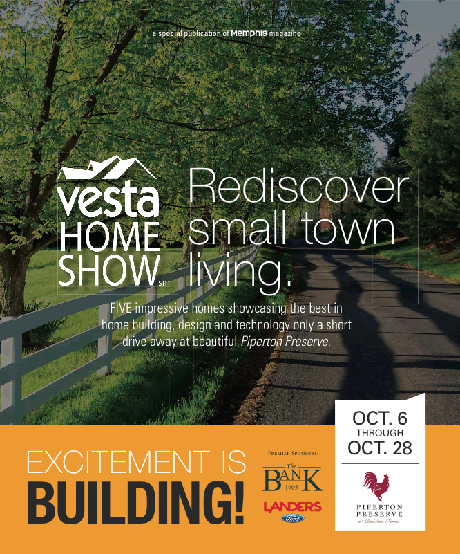
Vesta Home Show '18
For the third (!) year in a row I was honored to lay out the VESTA Home Show booklet for Memphis Magazine. However, unlike previous years I had the unique opportunity to work off of the branding concept of the fine people at Farmhouse Branding. I based my colors and a lot of my line angles around their concepts and conferred with them over email to make sure everything worked together. This was an extremely gratifying project that gave me the chance to work with people I don’t usually have to chance to work with and I really enjoyed it. Can’t wait for enxt year! * fingers crossed *
Vesta Home Show '17
Near the end of 2017 I had the pleasure of laying out the booklet for the VESTA Home Show. This was my second year in a row so I felt like I really had a handle on it this time around. I decided to mix a simple wood pattern with a subtle white/gray marble and a dark blue. It turned out looking pretty classy, if I do say so myself.
Neighborhood Preservation, Inc.
Through my job at Contemporary Media, Inc. I had to chance to work on a project for Neighborhood Preservation, Inc., a local anti-blight non-profit. It was a pretty straight forward brochure meant to be something they could show off to get donations and what not. They wanted something to show off their projects and their vision as a non-profit but they wanted to be flashy and eye-catching at the same time. They provided a lot of great photos and content and I put together a solid brochure for them. Sadly, the project was post-posted indefinitely so a lot of the information is still placeholder but I'm still pretty proud of the work I did.
Scene Dining Fall '16
Twice a year Memphis Magazine does an advertorial section about local restaurants that really make Memphis special. In the Fall of 2016, while still relatively new at CMI, I was given the task of updating the aesthetic of the section. I went in a more icon-driven direction and I think it turned out really fun.


